Moodle 4.1 has arrived – And it looks good
ETH Moodle has a new look and feel. In this blog we will provide an overview of the most important changes. This post is primarily written for teachers. We encourage you to explore the new interface for yourself. If you need more support, ETH Moodle teachers can register for a workshop in this Moodle course. Contact Moodle Support for more assistance: moodle@let.ethz.ch +41 44 632 06 65 (9:00-17:00)
Log in as usual with moodle-app2.let.ethz.ch.
Landing page: your dashboard
You now land directly on your personal dashboard. The dashboard combines the previous site home page and the previous dashboard. All users will notice the new top navigation menu which contains the elements ‘Course search’, ‘Support’ and ‘News’. At the top of the dashboard you may also find dismissible or time-limited announcements.
By clicking on your profile picture, you will see a new item called ‘My Media’. This is the new personal media repository system for teachers and students alike.
The dashboard is fully customisable for all Moodle users. Teachers and students can edit the dashboard (by using the editing button on the top right) in order to move sections (called blocks), add new ones or remove the ones currently on display. The new standard dashboard contains:
- occasional important announcements. These will be dismissible or time-limited.
- a timeline displaying upcoming tasks that are due. Teachers are encouraged to use deadlines for assignments and tasks as these will be featured prominently. Read more about the timeline block
- recently accessed courses.
- an overview of all courses where you are enrolled. You can change the appearance so the courses are displayed as a list or as cards for example. You can ‘star’ courses and select to only see future, in-progress or past courses. Note: This requires teachers to set correct start and end dates in the settings of each course. To add a custom image for your course, upload one via your course settings page. Visit this blog entry for detailed instructions.
- a calendar displayed as a slide block.
Course view
Once you visit a course you’ll notice the new look with more white space. The existing content of your courses has not have changed, however the appearance may differ slightly.
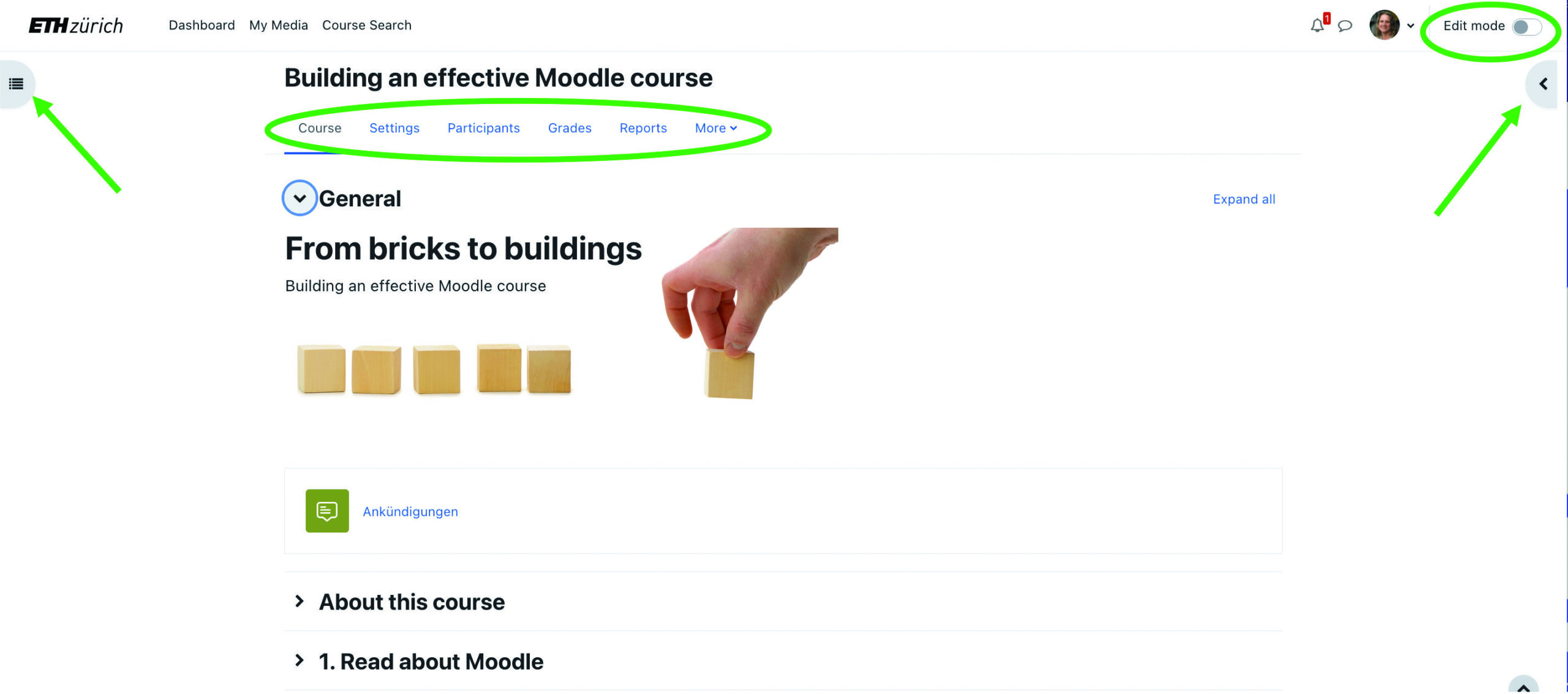
The new edit button is still found top right. You can choose to view the course navigation (on the left) and the blocks in the course (on the right) or you can hide them.
The new course menu contains fast access to the course settings, participants, grades, reports and more. Under ‘more’ is where you find ‘course reuse’ which allows you to import content.
Important: we recommend revisiting your choice of course format. The format ‘collapsed topics’ has few benefits as the format ‘topics’ is now also collapsible. In addition, the side navigation makes moving through the course easier and faster. Please be aware that the format ‘Tiles’ does not allow for the side navigation to be displayed. We no longer recommend the use of ‘Grid’ as it does not meet accessibility expectations.
Activity chooser
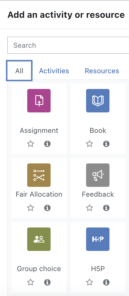
When adding a new activity or resource, you’ll notice the icons for most activities and resources have changed. They have been loosely grouped in to categories and have been allocated a colour to aid with faster recognition. The categories and colours are:
Assessment: purpur
Content: blue
Collaboration: green
Communication: grey
Administration: bronze
The resource ‘label’ has now been renamed ‘text and media area’ in order to more accurately describe its function.
The activities and resources are also more like blocks on the page which makes rearranging them via drag-and-drop much easier. Optically, displaying the activity descriptions on the course page is much more pleasing to the eye. Try it yourself.
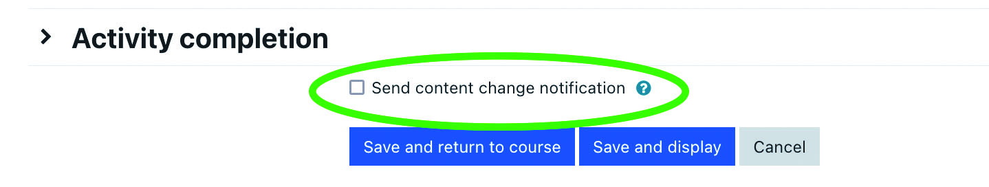
Notification on new content
New! When you edit an activity or resources you have the choice to notify course participants. To do so, check the box at the bottom of the activity/resource settings page before saving. This triggers a notification to all course participants.
For more information about detailed changes please visit the Moodle website:
https://docs.moodle.org/401/en/New_features
https://docs.moodle.org/400/en/New_features

Posted on
in Activities
Das neue Layout ist schlechter als das Alte. Da sich das menu links nicht mehr deutlich vom text rechts abhebt ist die User Experience schlechter da die wichtigen Dinge nicht mehr im Vordergrund sind!
Vielen Dank für Deine Rückmeldung! Das von Dir beschriebene Verhalten wird durch diverse Faktoren bestimmt wie benutzter Browser, installierte Browser Add-Ons, Betriebssystem und Bildschirmgrösse. Wir bitten Dich, uns einen Screenshot mitsamt den Angaben zu benutztem Browser, installierten Browser Add-Ons, Betriebbsystem und Bildschirmauflösung an moodle@let.ethz.ch zu senden, damit wir Deine Rückmeldung genauer anschauen können.
The web response time is a bit too long for sometime.
Thank you for your comment. Please send a message to moodle@let.ethz.ch which includes the following information: browser, browser add-on if you use any, operating system of your computer, exact URL of the Moodle content which takes a bit too long to respond, information whether you are accessing Moodle from ETH network or outside (if outside, let us know if you use VPN). We’ll happily investigate the causes for you.
Ich würde mich über einen Dark mode freuen. Das neue Layout ist sehr, sehr weiss; da werden meine Augen einfach schneller müde.
Vielen Dank für Deinen Kommentar. Der Dark Mode ist eine Funktion, welches wir gerne in unsere Feature-Wünsche aufnehmen.
Hallo Zusammen
Kleine Bemerkung zum neuen Login Screen. Der Login Screen entspricht nicht den ETH Corporate Design Richtlinien (und ehrlich gesagt sieht hellgraues Logo auf weissem Grund auch einfach nicht gut aus).
Schaut euch doch das mal an.
Gruss
Silvan
Lieber Silvan
Danke für dein Kommentar. Wir werden es uns anschauen. Gewisse visuelle Elemente sind von Moodle als Applikation her vorgegeben. Aufgrund der mittlerweile sehr stark eingeschränkten Kapazitäten bei uns ist es leider nicht mehr möglich, ein eigenes Theme zu entwickeln.
Beste Grüsse,
Das Moodle Team
The old Moodle was better. I dislike anything new.
Thank you for taking the time to write. Changes do take a bit of time to get used to. If you would like to provide specific commentary on what you don’t like, then perhaps we can provide you with more information or assistance.
Hey ^^
New UI looks more modern than before, but takes up a bit to much vertical space IMO.
Furthermore there is one thing that must be improved: make to logo for folders and PDFs a different color, and dont distinguish them by form only. Before pfds had the adobe logo and where well destingushable from folders, whereas now they can be easily confused with the folder icon. Maybe to the folder in a yellowish like the windows folders / pdfs red ala adobe? Or just a light & dark blue?
Thank you for your comment. We agree that the icons are very similar. However, due to reduced capacity in the Moodle service at LET, we currently must rely on core functionalities of Moodle here. As soon as there is an improvement in the core, we will change the colours.
The new UI is aesthetically speaking better than the old one, however it is a bit too slow to navigate in the sense that everything is too “spread out”. What I mean by that is the exagerated amount of vertical space between documents when scrolling through the right side of the page. I would suggest to either reduce the space or make it adjustable by the end user (kind of like the spacing/word size is adjustable in the system settings of iOS)
Dear Emilio, thank you for your comment and the feedback. I will communicate your suggestions to our Moodle Team. However, due to limited resources in our own development team, we have to stick to the basic core layout of Moodle 4.x. As soon as improvement is made there, we can integrate this into ETH Moodle.
Dark Mode please 🙂