The creation of the ITS Logo
This logo looks pretty familiar, right? But do you also know what it represents?
ITS History Part 1
IT Services (ITS) has been a central component of ETH Zurich for almost 30 years. More than 300 people work at ITS in various sections. Many of them have been here for decades, others only for a few months. IT Services is in a constant state of flux, which is positive on the one hand as it makes it possible to keep up with developments throughout ETH. On the other hand, however, it further obscures the origins of IT Services, meaning that many people have an even less clear idea of its early days. For this reason, we would like to take a trip into the past in the following blog posts in order to keep IT Services young in our minds. Today’s post is dedicated to our personal logo – the ITS logo.
ITS Logo
The ITS logo is used internally for mailboxes, smaller cards, etc., and is also published externally on posters and flyers.
It makes IT Services externally recognisable and provides an internal sense of community. Most will know this logo but many will have no idea about the background of the picture or what it represents. That’s why I sat down with one of the creative minds behind this logo to learn more about it.
Origins of the ITS Logo
Nathalie Schmidig, who works at ITS Multimedia Services, is the graphic designer behind the logo and was able to explain to me exactly what the meaning behind the picture is: the origins of the logo lie in the dome of ETH Zurich, where our roots lie.
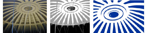
The original image, intermediate step and final result.
The ETH Dome
A simple photo of the impressive architecture, shot by Hans Hiltbrunner (ITS System Services, now retired), gave birth to the idea of giving IT Services a certain recognition value with a uniform logo. Nathalie Schmidig, at that time still at ITS System Services, put the project into practice. But why exactly the ETH dome? To begin with, the dome is the emblem of ETH Zurich. It can already be seen from a great distance and makes the university unique. But this is by no means the only reason. The dome offers a variety of interpretations that always focus on something different. The supporting pillars, which lead outwards from the centre of the cupola roof, are reminiscent of a spider’s web and thus underline the centrality of IT Services. In addition, it shows the cohesion within our organisation and that rather than each section working individually, the whole department acts as a team.
It all began in the Dome
By far the most important point, however, is another one: IT Services had its beginnings in the dome!
IT Services has not always been organised as it is now. On the contrary: it all started small. Jürgen Winkelmann, Head of the System Services division, was there from the very beginning. His career began in the computer centre of Dornier Flugzeugwerke on Lake Constance. Manfred Flemming, then Head of the statics section at Dornier, was appointed Professor at the Institute for the Fundamentals of Machine Design at ETH Zurich in the mid-1980s. The aim was to train prospective mechanical engineers in the application of computer-aided design and manufacturing (CAD/CAM). To give what was back then state-of-the-art technology appropriate visibility, a prominent location was found with the dome of the main building. Jürgen Winkelmann was entrusted with the supervision of the CAD system in the dome at that time. From the dome, he soon provided Professor Flemming’s institute with much more than just CAD/CAM technology – he also delivered general IT services. This stood in a certain conflict with the work of the IT services of the time (at that time called computer centres). This conflict was resolved by integrating CAD/CAM services into the IT Services portfolio after a transition phase of about three years of joint service provision. Similar integrations of former services from other institutes ended up leading to IT Services as we know it today. The IT Services logo and the words «CADETH Zentrum» on the door to the cupola room, which should not be confused with the non-existent «ETH Cadet Centre», are reminiscent of that time. Visitor groups often used to ask about this, because CAD was not yet a familiar term.
Eye, sun, flower?
For my part, I assumed at the beginning of my time at ETH that the logo was an eye. When I saw the original picture, I thought that I was completely on the wrong track, but it turned out that it was not an absurd thought, as Nathalie Schmidig explained to me. It was even one of the reasons why this logo seemed appropriate: the similarity to various natural objects such as an eye, the sun or a flower. The latter both radiate friendliness and warmth and the former suggests security – a watchful eye that pays attention to the entire ETH.
Resemblances to..
As unique as the logo is, it does recall a few other things too. Nathalie Schmidig told me about some in the department telling her that the logo reminded them of the Japanese war flag. At this mention, others became aware of the similarity for the first time too. Other organisations also made use of the simple three-dimensional funnel-shaped pattern in blue and white, which is why our logo can also be found on a poster pillar in Lucerne… almost, at least.

However, these were and are only funny anecdotes and coincidences that people like to tell each other. There have been no negative opinions from outside. And so in 2003, a timeless logo was created for IT Services, and it has now been in use for over 16 years. Our services are no longer as inconspicuous as they used to be – all due to a single small change.
Contact
- Sabine Hoffmann, ITS, PR & Communications, IT Services
- Text Kaja Walter, ITS PR & Communication Intern
erstellt am
in News